私はこの回答で外に出てきたかもしれませんが、いくつかのことをテストするのは面白かったので、私は完全な解決策を作りました。レイアウトは、ほとんどの要素のサイズ変更に適応します。私はできるだけ編集しやすいようにCSSを作ろうとしました。
あなたがする必要があるのは、好きなだけ何度でも複製をlevel_2_entry_containerすることです。これは、クライアント側またはサーバー側の2つのコード行で簡単に実行できます。コンテンツの構造は、左右の両方で同じです(方向と位置はCSSで制御されます)。
ChromeとFirefoxの最新バージョンでテスト済みです。
body {

    font-family: Helvetica, Arial, sans-serif;

    font-size: 12px;

    color: #444;

}

.main_container {

    min-width: 400px;

    margin-top: 20px;

    margin-bottom: 20px;

}

.solution_container {

    position: relative;

}

.flex_container {

    display: flex;

    flex-direction: row;

    flex-wrap: nowrap;

    justify-content: center;

    align-items: center;

    position: relative;

    z-index: 2;

}

.flex_item {

    flex-grow: 1;

    flex-shrink: 1;

    flex-basis: 0;

}

.flex_item_static {

    flex-grow: 0;

    flex-shrink: 0;

    flex-basis: auto;

    position: relative;

}

.level_1_entry_image {

    width: 160px; /* change according to preference */

    height: 160px; /* change according to preference */

    display: block;

    border-radius: 50%;

    box-sizing: border-box;

    border: solid 4px #eee;

    background-color: #eee;

}

.level_1_entry_content {

    padding-left: 20px; /* change according to preference - controls text distance from level_1_image */

}

.center_line {

    position: absolute;

    width: 4px;

    height: 100%;

    top: 0px;

    left: 50%;

    margin-left: -2px;

    background-color: #eee;

    z-index: 1;

}

.center_footer {

    position: absolute;

    width: 20px;

    height: 4px;

    bottom: 0px;

    left: 50%;

    margin-left: -10px;

    background-color: #eee;

    z-index: 1;

}

.level_2_entry_container {

    width: 50%;

    box-sizing: border-box;

    margin-top: -50px;

}

.level_2_entry_container:first-child {

    margin-top: 0px;

}

.level_2_entry_container:nth-child(odd) {

    margin-right: auto;

}

.level_2_entry_container:nth-child(even) {

    margin-left: auto;

}

.level_2_entry_image,

.level_2_entry_content {

    margin: 20px; /* change according to preference - controls level_2_image distance from central_line */

}

.level_2_entry_image {

    width: 100px; /* change according to preference */

    height: 100px; /* change according to preference */

    display: block;

    border-radius: 50%;

    box-sizing: border-box;

    border: solid 4px #eee;

    position: relative;

    z-index: 2;

    background-color: #eee;

}

.level_2_entry_container:nth-child(odd) .level_2_entry_image {

    margin-left: 0px !important;

    margin-bottom: 0px !important;

}

.level_2_entry_container:nth-child(even) .level_2_entry_image {

    margin-right: 0px !important;

    margin-bottom: 0px !important;

}

.level_2_entry_content {

    margin-left: 0px !important;

    margin-right: 0px !important;

    margin-bottom: 0px !important;

    padding: 20px; /* change according to preference - controls text distance from level_2_image */

    padding-top: 0px;

    padding-bottom: 0px;

}

.level_2_entry_container:nth-child(odd) .level_2_entry_content {

    padding-left: 0px !important;

    text-align: right;

}

.level_2_entry_container:nth-child(even) .level_2_entry_content {

    padding-right: 0px !important;

    text-align: left;

}

.diagonal_line_1,

.diagonal_line_2 {

    position: absolute;

    width: 75%;

    height: 75%;

    z-index: 1;

    top: 0px;

}

.diagonal_line_1 {

    right: 0px;

}

.diagonal_line_2 {

    left: 0px;

}

.level_2_entry_container:nth-child(odd) .diagonal_line_2 {

    display: none;

}

.level_2_entry_container:nth-child(even) .diagonal_line_1 {

    display: none;

}

.level_2_entry_container:nth-child(odd) > .flex_container > .flex_item:nth-child(1) {

    order: 1;

}

.level_2_entry_container:nth-child(odd) > .flex_container > .flex_item:nth-child(2) {

    order: 2;

}

.level_2_entry_container:nth-child(even) > .flex_container > .flex_item:nth-child(1) {

    order: 2;

}

.level_2_entry_container:nth-child(even) > .flex_container > .flex_item:nth-child(2) {

    order: 1;

}
<!DOCTYPE html>

<html>

    <head>

     <meta charset="UTF-8" />

     <meta http-equiv="content-type" content="text/html;charset=UTF-8"/>

    </head>

    <body>

     <div class="main_container">

      <div class="solution_container">

       <div class="flex_container">

        <div class="flex_item"></div>

        <div class="flex_item flex_item_static">

         <img class="level_1_entry_image" src="http://placehold.it/320x320"/>

        </div>

        <div class="flex_item">

         <div class="level_1_entry_content">Lorem ipsum dolor sit amet</div>

        </div>

       </div>

       <div class="center_line"></div>

       <div class="center_footer"></div>

       <div class="level_2_container">

        <div class="level_2_entry_container">

         <div class="flex_container">

          <div class="flex_item">

           <div class="level_2_entry_content">Lorem ipsum dolor sit amet</div>

          </div>

          <div class="flex_item flex_item_static">

           <img class="level_2_entry_image" src="http://placehold.it/200x200"/>

           <svg viewbox="0 0 10 10" preserveAspectRatio="none" class="diagonal_line_1">

            <line x1="10" y1="0" x2="0" y2="10" stroke="#eee" stroke-width="0.4" />

           </svg>

           <svg viewbox="0 0 10 10" preserveAspectRatio="none" class="diagonal_line_2">

            <line x1="0" y1="0" x2="10" y2="10" stroke="#eee" stroke-width="0.4" />

           </svg>

          </div>

         </div>

        </div>

       </div>

      </div>

     </div>

    </body>

</html>
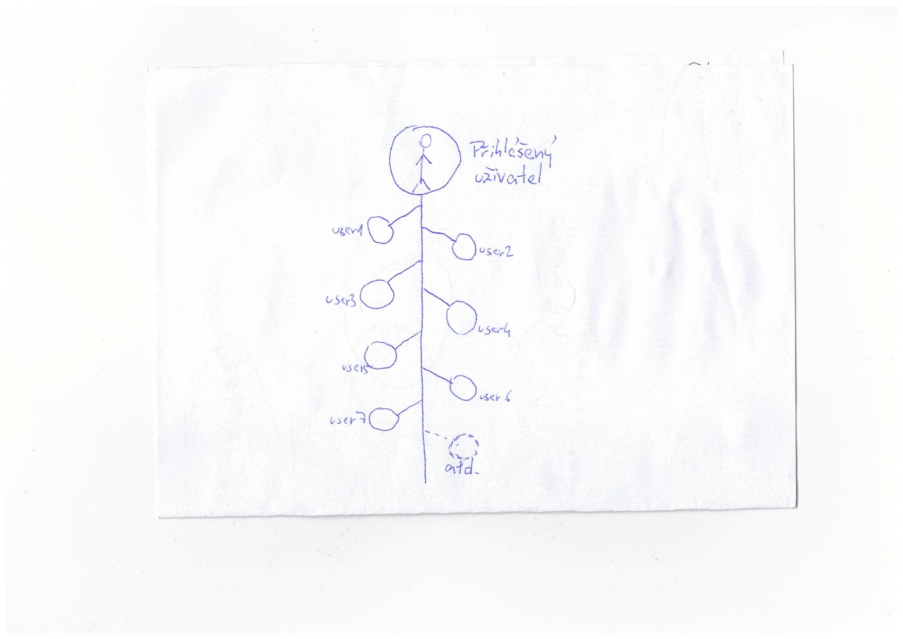 特定の "ツリービュー"を作成する方法
お読みください:[どのようなトピック私は約ここに求めることができますか?](http://stackoverflow.com/help/on-topic)。 _本物の答えや迷惑メールを引き付ける傾向があるため、本、ツール、**ソフトウェアライブラリ、チュートリアル、その他のオフサイトリソースを推薦**してくれる質問**はスタックオーバーフローのトピック**です。 _ –
コードなし回答なし – Gert
col1:user1 lable、col2:user1 image、col3:ブランチコネクタ、col4:水平線とcol5:ユーザー2などのように7列のテーブルとして描画できます。 – Anil