2016-04-29 9 views
2

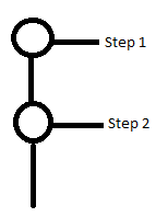
CSSの右と下の線で円を作成したいと思います。下の写真と同様です。私は円を水平に接続するCSS codeを見つけました。どのように垂直に、または添付の画像に類似した線を追加するのか分かりませんか?縦と横の線で結ばれたCSSサークルの作成

enter image description here

<!DOCTYPE html> 
    <html lang="en"> 
     <head> 
      <meta charset="utf-8"> 
      <style> 
      @import "compass/css3"; 

      li { 
       width: 2em; 
       height: 2em; 
       text-align: center; 
       line-height: 2em; 
       border-radius: 1em; 
       background: dodgerblue; 
       margin: 0 1em; 
       display: inline-block; 
       color: white; 
       position: relative; 
      } 

      li::before { 
       content: ''; 
       position: absolute; 
       top: .9em; 
       left: -4em; 
       width: 4em; 
       height: .2em; 
       background: dodgerblue; 
       z-index: -1; 
      } 

      li:first-child::before { 
       display: none; 
      } 

      .active { 
       background: dodgerblue; 
      } 

      .active ~ li { 
       background: lightblue; 
      } 

      .active ~ li::before { 
       background: lightblue; 
      } 

      body { 
       font-family: sans-serif; 
       padding: 2em; 
      } 
     </style> 
    </head> 
    <body> 
     <ul> 
      <li>1</li> 
      <li>2</li> 
      <li>3</li> 
      <li class="active">4</li> 
      <li>5</li> 
      <li>6</li> 
      <li>7</li> 
     </ul> 
    </body> 
</html> 

答えて

0

更新ペンチェックアウト:以下

http://codepen.io/Debabrata89/pen/QNZrxE

を、関連するコードです:

HTML:

<div></div><span id="step1">step1</span> 
<div id="second"></div> 
<div></div><span id="step2">step2</span> 
<div id="last"></div> 

CSS:

@import "compass/css3"; 

div { 
    width: 2em; 
    height: 2em; 
    text-align: center; 
    line-height: 2em; 
    border-radius: 1em; 
    background: dodgerblue; 
    margin: 0 1em; 
    color: white; 
    position: relative; 
-ms-transform: rotate(-180deg); 
-webkit-transform: rotate(-180deg); 
transform: rotate(-180deg); 
} 

div::before{ 
    content: ''; 
    position: absolute; 
    top: .9em; 
    left: -4em; 
    width: 4em; 
    height: .2em; 
    background: dodgerblue; 
    z-index: -1; 

} 


div:first-child::after { 
    display: none; 
} 


body { 
    font-family: sans-serif; 
    padding: 2em; 
} 
#last{ 
    transform: rotate(-90deg); 
    width:0; 
    height:0; 
} 
#second{ 
    transform: rotate(-90deg); 
    width:0; 
    height:10; 
    left:16px; 
    top:-16px; 

} 
#step1{ 
    position:absolute; 
    top:40px; 
    left:150px 
} 
#step2{ 
    position:absolute; 
    top:104px; 
    left:150px 
} 
1

this fiddleを試してみてください。

いくつかのプロパティを変更し、li:afterを追加しました。

li { 
    width: 2em; 
    height: 2em; 
    text-align: center; 
    line-height: 2em; 
    border-radius: 1em; 
    background: dodgerblue; 
    margin: 1em 1em; 
    color: white; 
    position: relative; 
} 
li::before { 
    content: ''; 
    position: absolute; 
    top: -4.1em; 
    left: 1em; 
    /* width: 4em; */ 
    width: .2em; 
    height: 2em; 
    background: dodgerblue; 
    z-index: -1; 
} 
li::after { 
    content: ''; 
    position: absolute; 
    top: 0.9em; 
    left: 1em; 
    width: 4em; 
    height: .2em; 
    background: dodgerblue; 
    z-index: -1; 
} 
li:first-child::before { 
    display: none; 
} 
.active { 
    background: dodgerblue; 
} 
.active ~ li { 
    background: lightblue; 
} 
.active ~ li::before { 
    background: lightblue; 
} 
body { 
    font-family: sans-serif; 
    padding: 2em; 
} 
4

目的を達成するために擬似要素の組み合わせを使用します。

ul { 
 
    list-style: none; 
 
    margin: 50px; 
 
    padding: 0; 
 
    font: normal 16px/22px Arial; 
 
    color: #999; 
 
} 
 
li { 
 
    overflow: hidden; 
 
    position: relative; 
 
    padding: 0 0 10px 35px; 
 
    } 
 
    li::before { 
 
    content: ''; 
 
    position: absolute; 
 
    left: 9px; 
 
    top: 9px; 
 
    width: 20px; 
 
    height: 999px; 
 
    border: 2px solid lightblue; 
 
    border-width: 2px 0 0 2px; 
 
    } 
 
    li:last-child::before { 
 
     border-width: 2px 0 0; 
 
     } 
 
    li::after { 
 
    content: ''; 
 
    position: absolute; 
 
    left: 0; 
 
    top: 0; 
 
    width: 16px; 
 
    height: 16px; 
 
    background: #fff; 
 
    border: 2px solid lightblue; 
 
    border-radius: 50%; 
 
    } 
 
    li.current, 
 
    li.passed { 
 
    color: #000; 
 
    } 
 
    li.current::before { 
 
     border-top-color: dodgerblue; 
 
     } 
 
    li.current::after { 
 
     border-color: dodgerblue; 
 
     background: dodgerblue; 
 
     } 
 
    li.passed::before, 
 
    li.passed::after { 
 
     border-color: dodgerblue; 
 
     }
<ul> 
 
    <li class="passed">Step #1</li> 
 
    <li class="passed">Step #2</li> 
 
    <li class="passed">Step #3</li> 
 
    <li class="current">Step #4<br><small><i>Description of the step</i></small></li> 
 
    <li>Step #5</li> 
 
    <li>Step #6</li> 
 
    <li>Step #7</li> 
 
</ul>

あなたが

を好む場合 jsfiddleを参照してください。
関連する問題