0
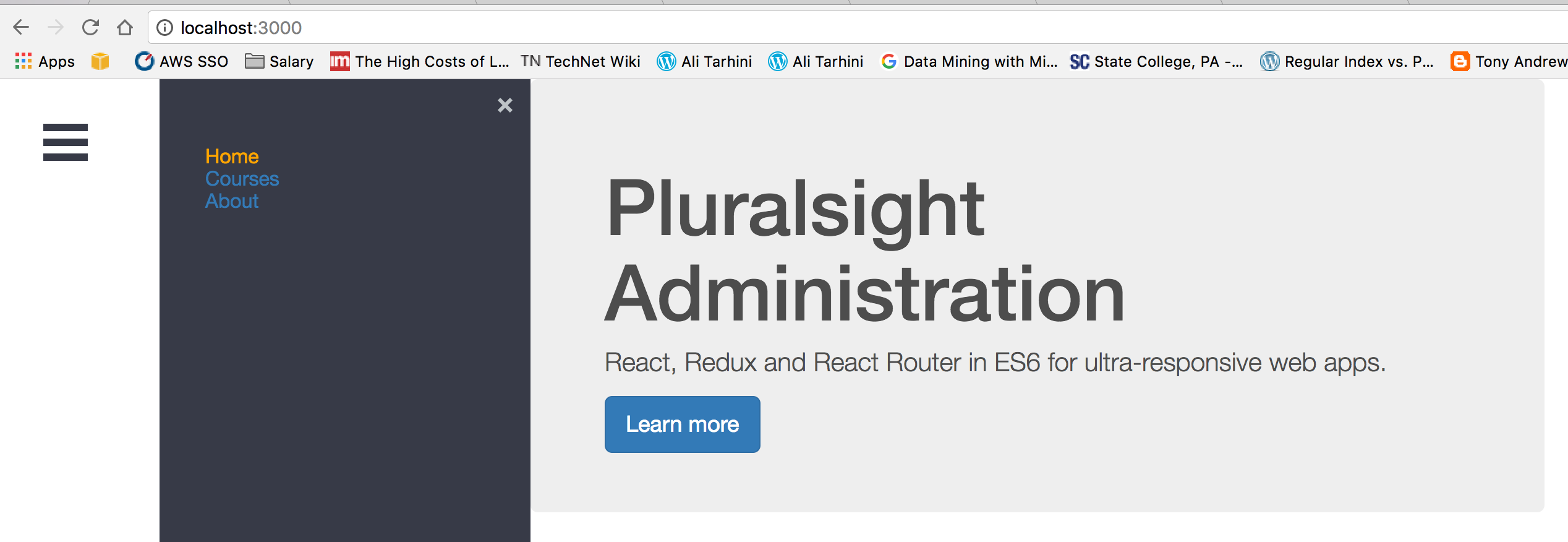
私はこのガイド(https://github.com/negomi/react-burger-menu)を使用して反応ルータで反応バーガーメニューを実装しようとしています...特にこの部分https://github.com/negomi/react-burger-menu/wiki/FAQ#why-doesnt-the-link-component-from-react-router-work。私が抱えている問題は、メニューボタンがメニューの左に配置されているように見えて、メニューが隠れていないように見えるということです。添付のスクリーンショットのように見えます。react-burger-menuを反応ルータで使用する
私のコードは次のようになります。
app.js
// This component handles the App template used on every page.
import React, {PropTypes} from 'react';
import SideBar from './common/Header';

class App extends React.Component {
    render() {
     return (
      <div className="container-fluid">
         <SideBar />
         {this.props.children}
      </div>
     );
    }
}

App.propTypes = {
    children: PropTypes.object.isRequired
};

export default App;
header.js
import React, {PropTypes} from 'react';
import { Link, IndexLink } from 'react-router';
import {slide as Menu} from 'react-burger-menu';
import Radium from 'radium';

let RadiumLink = Radium(Link);
let RadiumIndexLink = Radium(IndexLink);

const SideBar =() => {
    return (


    <Menu className="bm-menu">
     <RadiumIndexLink className="bm-item-list" to="/" activeClassName="active">Home</RadiumIndexLink>
     <RadiumLink className="bm-item-list" to="/courses" activeClassName="active">Courses</RadiumLink>
     <RadiumLink className="bm-item-list" to="/about" activeClassName="active">About</RadiumLink>
    </Menu>

    );
};

export default SideBar;
のstyle.cssには
#app {
    font: 14px 'Helvetica Neue', Helvetica, Arial, sans-serif;
    color: #4d4d4d;
    min-width: 550px;
    max-width: 850px;
    margin: 0 auto;
}

a.active {
    color: orange;
}

nav {
    padding-top: 20px;
    padding-bottom: 20px;
}

/* Position and sizing of burger button */
.bm-burger-button {
    position: fixed;
    width: 36px;
    height: 30px;
    left: 36px;
    top: 36px;
}

/* Color/shape of burger icon bars */
.bm-burger-bars {
    background: #373a47;
}

/* Position and sizing of clickable cross button */
.bm-cross-button {
    height: 24px;
    width: 24px;
}

/* Color/shape of close button cross */
.bm-cross {
    background: #bdc3c7;
}

/* General sidebar styles */
.bm-menu {
    background: #373a47;
    padding: 2.5em 1.5em 0;
    font-size: 1.15em;
}

/* Morph shape necessary with bubble or elastic */
.bm-morph-shape {
    fill: #373a47;
}

/* Wrapper for item list */
.bm-item-list {
    color: #b8b7ad;
    padding: 0.8em;
}

/* Styling of overlay */
.bm-overlay {
    background: rgba(0, 0, 0, 0.3);
}
なぜ実際のメニューの左側に表示されるトグルボタンで、なぜ実際のメニューは非表示になりませんか?私はトグルをクリックすると、メニューがちょうど、さらに右にシフト...