2013-07-16 8 views
23

いいえ、CornerRadiusを定義しているボタンと他の2つのボタンを定義したいのですが、これをどのように達成できますか?ボタンテンプレートのCornerRadiusを設定する

<Style TargetType="Button" x:Key="TabButton"> 
    <Setter Property="Background" Value="White" /> 
    <Setter Property="TextBlock.TextAlignment" Value="Center" /> 
    <Setter Property="Template"> 
     <Setter.Value> 
      <ControlTemplate TargetType="Button"> 
       <Border CornerRadius="0" Background="White" BorderBrush="#ccc" BorderThickness="0,1,1,0" > 
        <ContentPresenter x:Name="contentPresenter" ContentTemplate="{TemplateBinding ContentTemplate}" Content="{TemplateBinding Content}" HorizontalAlignment="{TemplateBinding HorizontalContentAlignment}" Margin="{TemplateBinding Padding}" VerticalAlignment="{TemplateBinding VerticalContentAlignment}"/> 
       </Border> 
      </ControlTemplate> 
     </Setter.Value> 
    </Setter> 
</Style> 

<Style TargetType="Button" x:Key="TabButtonFirst" BasedOn="{StaticResource TabButton}"> 
    <Setter Property="CornerRadius" Value="3,0,0,0" /> 
</Style> 

<Style TargetType="Button" x:Key="TabButtonLast" BasedOn="{StaticResource TabButton}"> 
    <Setter Property="CornerRadius" Value="0,0,0,3" /> 
</Style> 
+2

ボタンCornerRadiusプロパティを持っていません。 ControlTemplateでBorderコントロール用に設定します。 – Nitesh

+4

あなたは何をしているのかを達成するためにButtonに2つのスタイルが必要です。あるいは、CornerRadiusをDependencyPropertyとして実装するカスタムボタンを作成し、それをControlTemplateのBorderのCornerRadiusにバインドします。 – Nitesh

答えて

26

Niteshは、あなたがボタンの上にCornerRadiusプロパティを持っていないと述べたように、あなたの最初のスタイルで示したように、それはちょうどあなたの最初のスタイルを複製し、CornerRadiusを変更、ボーダーの財産である、そして割り当てます適切なボタンのスタイルに合わせてください。

<Window x:Class="WpfApplication1.MainWindow" 
     xmlns="http://schemas.microsoft.com/winfx/2006/xaml/presentation" 
     xmlns:x="http://schemas.microsoft.com/winfx/2006/xaml" 
     Title="MainWindow" Height="350" Width="525"> 
    <Window.Resources> 
     <Style TargetType="Button" x:Key="TabButton"> 
      <Setter Property="Background" Value="White" /> 
      <Setter Property="TextBlock.TextAlignment" Value="Center" /> 
      <Setter Property="Template"> 
       <Setter.Value> 
        <ControlTemplate TargetType="Button"> 
         <Border CornerRadius="0" Background="White" BorderBrush="#ccc" BorderThickness="0,1,1,0" > 
          <ContentPresenter x:Name="contentPresenter" ContentTemplate="{TemplateBinding ContentTemplate}" Content="{TemplateBinding Content}" HorizontalAlignment="{TemplateBinding HorizontalContentAlignment}" Margin="{TemplateBinding Padding}" VerticalAlignment="{TemplateBinding VerticalContentAlignment}"/> 
         </Border> 
        </ControlTemplate> 
       </Setter.Value> 
      </Setter> 
     </Style> 
     <Style TargetType="Button" x:Key="TabButtonFirst"> 
      <Setter Property="Background" Value="White" /> 
      <Setter Property="TextBlock.TextAlignment" Value="Center" /> 
      <Setter Property="Template"> 
       <Setter.Value> 
        <ControlTemplate TargetType="Button"> 
         <Border CornerRadius="3,0,0,0" Background="White" BorderBrush="#ccc" BorderThickness="0,1,1,0" > 
          <ContentPresenter x:Name="contentPresenter" ContentTemplate="{TemplateBinding ContentTemplate}" Content="{TemplateBinding Content}" HorizontalAlignment="{TemplateBinding HorizontalContentAlignment}" Margin="{TemplateBinding Padding}" VerticalAlignment="{TemplateBinding VerticalContentAlignment}"/> 
         </Border> 
        </ControlTemplate> 
       </Setter.Value> 
      </Setter> 
     </Style> 
     <Style TargetType="Button" x:Key="TabButtonLast"> 
      <Setter Property="Background" Value="White" /> 
      <Setter Property="TextBlock.TextAlignment" Value="Center" /> 
      <Setter Property="Template"> 
       <Setter.Value> 
        <ControlTemplate TargetType="Button"> 
         <Border CornerRadius="0,0,0,3" Background="White" BorderBrush="#ccc" BorderThickness="0,1,1,0" > 
          <ContentPresenter x:Name="contentPresenter" ContentTemplate="{TemplateBinding ContentTemplate}" Content="{TemplateBinding Content}" HorizontalAlignment="{TemplateBinding HorizontalContentAlignment}" Margin="{TemplateBinding Padding}" VerticalAlignment="{TemplateBinding VerticalContentAlignment}"/> 
         </Border> 
        </ControlTemplate> 
       </Setter.Value> 
      </Setter> 
     </Style> 
     </Window.Resources> 
     <Grid Background="Black"> 
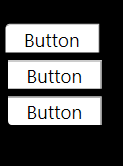
     <Button Style="{StaticResource TabButton}" Content="Button" Height="23" HorizontalAlignment="Left" Margin="12,72,0,0" Name="button1" VerticalAlignment="Top" Width="75" /> 
     <Button Style="{StaticResource TabButtonFirst}" Content="Button" Height="23" HorizontalAlignment="Left" Margin="10,43,0,0" Name="button2" VerticalAlignment="Top" Width="75" /> 
     <Button Style="{StaticResource TabButtonLast}" Content="Button" Height="23" HorizontalAlignment="Left" Margin="12,101,0,0" Name="button3" VerticalAlignment="Top" Width="75" /> 
    </Grid> 
</Window> 

enter image description here

+0

機能は正常に機能しますが、ボタンはデフォルトのスタイルを失います。つまり、 "OnMouseOver"、 "OnMouseClick"イベントはボタンの視覚的な状態を変更しません。 – monstr

+1

小さな変更が1つしかないテンプレートが2つあるたびに、私はこの問題にぶつかります。この種の反復コードは本当に私を煩わします。より良い方法が必要です。 – Jordan

+4

@ジョーダン:そこに、私の答えを参照してください。 :) –

19

あなたがテンプレート化しているコントロールの依存関係プロパティに制限されていません。この場合、ButtonながらCornerRadius性質を持っていない、Borderはありませんので、あなたが代わりにBorder.CornerRadiusを使用することができます。

<Style TargetType="Button" x:Key="TabButton"> 
    <Setter Property="Background" Value="White" /> 
    <Setter Property="TextBlock.TextAlignment" Value="Center" /> 
    <Setter Property="Template"> 
     <Setter.Value> 
      <ControlTemplate TargetType="Button"> 
       <Border CornerRadius="{TemplateBinding Border.CornerRadius}" Background="White" BorderBrush="#ccc" BorderThickness="0,1,1,0" > 
        <ContentPresenter x:Name="contentPresenter" ContentTemplate="{TemplateBinding ContentTemplate}" Content="{TemplateBinding Content}" HorizontalAlignment="{TemplateBinding HorizontalContentAlignment}" Margin="{TemplateBinding Padding}" VerticalAlignment="{TemplateBinding VerticalContentAlignment}"/> 
       </Border> 
      </ControlTemplate> 
     </Setter.Value> 
    </Setter> 
</Style> 

<Style TargetType="Button" x:Key="TabButtonFirst" BasedOn="{StaticResource TabButton}"> 
    <Setter Property="Border.CornerRadius" Value="3,0,0,0" /> 
</Style> 

<Style TargetType="Button" x:Key="TabButtonLast" BasedOn="{StaticResource TabButton}"> 
    <Setter Property="Border.CornerRadius" Value="0,0,0,3" /> 
</Style> 

をこの方法で、あなたはもはやあなたのコントロールテンプレートの複数のコピーを維持する必要がありません。

+3

これは受け入れられた回答である必要があります –

+0

すばらしい答え! – Midas

+0

私は+1のコメントが嫌いだと知っていますが、この質問につながっている状況では、ほとんどの人が探しているはずの本当の答えです。 – MojoFilter

0

CornerRadius依存プロパティを含む独自のカスタムボタンクラス(Buttonから継承)を作成します。そして、あなたのスタイルのターゲットタイプがこの新しいクラスになり、テンプレートバインディングを使ってコーナー半径を設定することができます。

この方法では、コントロールテンプレートの複数のコピーを保持する必要はありませんが、コーナー半径を変更するたびに新しいスタイルを作成する必要はありません。 CornerRadius依存関係プロパティを直接設定またはバインドすることができます。

ので、制御のためのあなたのコードは次のようになります:それは、依存関係プロパティのデフォルト以来、何の角の半径を必要としない、あなたのボタンにそう

<Style TargetType="MyCustomButton" x:Key="TabButton"> 
    <Setter Property="Background" Value="White" /> 
    <Setter Property="TextBlock.TextAlignment" Value="Center" /> 
    <Setter Property="Template"> 
     <Setter.Value> 
      <ControlTemplate TargetType="MyCustomButton"> 
       <Border CornerRadius="{TemplateBinding CornerRadius}" Background="White" BorderBrush="#ccc" BorderThickness="0,1,1,0" > 
        <ContentPresenter x:Name="contentPresenter" ContentTemplate="{TemplateBinding ContentTemplate}" Content="{TemplateBinding Content}" HorizontalAlignment="{TemplateBinding HorizontalContentAlignment}" Margin="{TemplateBinding Padding}" VerticalAlignment="{TemplateBinding VerticalContentAlignment}"/> 
       </Border> 
      </ControlTemplate> 
     </Setter.Value> 
    </Setter> 
</Style> 

public class MyCustomButton : Button 
{ 
    public static readonly DependencyProperty CornerRadiusProperty = 
     DependencyProperty.Register("CornerRadius", typeof(CornerRadius), typeof(MyCustomButton), new FrameworkPropertyMetadata(new CornerRadius(0))); 

    public CornerRadius CornerRadius 
    { 
     get { return (CornerRadius)GetValue(CornerRadiusProperty); } 
     set { SetValue(CornerRadiusProperty, value); } 
    } 
} 

とXAMLを0にすると、何もする必要はありません。コーナー半径を持つものについては、通常のBorderのCornerRadiusプロパティと同様に、依存関係プロパティを適切な値に設定するだけです。

8

ただ、このような新しいボタンを作成します。

<!--Button--> 
      <Button 
       Name="myButton" 
       Content="OK" 
       FontFamily="Century Gothic" 
       Foreground="white" 
       Background="CornflowerBlue" 
       BorderThickness="0" 
       Padding="10" 
       Margin="10,5"> 

       <Button.Resources> 
        <Style TargetType="{x:Type Border}"> 
         <Setter Property="CornerRadius" Value="7"/> 
        </Style> 
       </Button.Resources> 

      </Button> 
+0

これはうまくいきません – chengzi

+0

ボタンに独自のプロパティを設定したい場合は、ニースで簡単な答えです。 –

関連する問題