2016-09-22 9 views
12

CSSやJavaScriptを使用して以下のアニメーションを模倣しようとしています。私は最初のステップを作成しましたが、ズームイン部分をアニメーション化する方法を理解することはできません。背景画像上でテキスト切り抜きをアニメーション化する方法

body { 
 
     background-color: #222; 
 
    } 
 
    .container { 
 
     background-image: url(test.jpg); 
 
     height: 96vh; 
 
     width: 100%; 
 
    } 
 
    .box { 
 
     background-color: #fff; 
 
     height: 98vh; 
 
     width: 100%; 
 
    } 
 
    .big { 
 
     font-size: 17vw; 
 
     background: url(http://viralsweep.com/blog/wp-content/uploads/2015/02/unsplash.jpg) 33px 659px; 
 
     -webkit-text-fill-color: transparent; 
 
     -webkit-background-clip: text; 
 
     padding-top: 24vh; 
 
     margin-top: 0; 
 
     text-align: center; 
 
     animation: opac 2s infinite; 
 
    } 
 
@keyframes opac { 
 
    0%, 100% { 
 
    /*rest the move*/ 


    } 
 
    50% { 
 
    /*move some distance in y position*/ 
 
    } 
 
}
<div class="container"> 
 
    <div class="box"> 
 
    <h1 class="big">TRY THIS</h1> 
 
    </div> 
 
    <!--end of box--> 
 
</div> 
 
<!--end of conatiner-->

そして、私のTARGET: enter image description here

+0

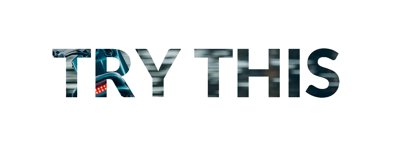
まあ、これはトラブルシューティングではありません。私はあなたが正当な試みをしたにもかかわらず、あなたが求めているものが多すぎることを恐れています。私はこれを打つつもりですが、この質問は閉じられる可能性があるので約束はありません。 –

+0

あなたが求めているコードの信頼できる/公式な情報源に名前を付けることはできますか?このようなソースの一般的な例であっても、この種のコードは利用できませんか? – Teemu

答えて

10

私は-webkit-text-fill-color-webkit-background-clip-textを使用して、元のコードに基づいて解決策を考え出したとアニメーションのためのfont-sizeと負text-indentを追加しました。要素内のテキストは常に左端にぶつかりたいので、要素内にテキストを中央に置くには、text-indentが必要です。

* { 
 
    box-sizing: border-box; 
 
    } 


    html, body { 
 
    height: 100%; 
 
    margin: 0; 
 
    padding: 0; 
 
    } 


    #container { 
 
    height: 160px; 
 
    overflow: hidden; 
 
    position: absolute; 
 
    width: 600px; 
 
    } 


    #image { 
 
    animation: scale 3000ms linear infinite; 
 
    background: url(http://viralsweep.com/blog/wp-content/uploads/2015/02/unsplash.jpg); 
 
    bottom: 0; 
 
    font: 96px "Arial"; 
 
    font-weight: bold; 
 
    left: 0; 
 
    line-height: 160px; 
 
    overflow: hidden; 
 
    position: absolute; 
 
    right: 0; 
 
    text-align: center; 
 
    top: 0; 
 
    text-transform: uppercase; 
 
    white-space: nowrap; 
 
    -webkit-text-fill-color: transparent; 
 
    -webkit-background-clip: text; 
 
    } 


    @keyframes scale { 
 
    0% { 
 
     font-size: 66px; 
 
     text-indent: 0; 
 
    } 
 
    16% { 
 
     font-size: 132px; 
 
     text-indent: 0; 
 
    } 
 
    80% { 
 
     font-size: 330px; 
 
     text-indent: -500px; 
 
    } 
 
    100% { 
 
     font-size: 10000px; 
 
     text-indent: -25300px; 
 
    } 
 
    }
<div id="container"> 
 
    <div id="image">try this</div> 
 
</div>

基本的に、私は、フォントサイズが増加するにつれて、中央の「T」が中心のまま(それはしかし中央には本当にありません)し、テキストになるようtext-indentを調整していますとても大きい(10,000ピクセル!)ので、 "T"はスペースを埋めることによって "明らかにする"効果を発揮します。

+0

参考までに、代わりに 'color'を使うだけで' -webkit-text-fill-color'を避けることができます。 'background-clip-text'には、Firefoxで動作するプレフィックスのないバージョンもあります。 – Ajedi32

14

働か、透明性を達成するために2つの要素、テキストの画像用と別の、およびブレンドモードを使用して:

ブレンドモードは、IEまたはEdgeではサポートされていません。

body, 
 
html { 
 
    width: 100%; 
 
    height: 100%; 
 
} 
 
.container { 
 
    position: absolute; 
 
    width: 100%; 
 
    height: 100%; 
 
    background: url(http://placekitten.com/1000/600); 
 
    background-size: cover; 
 
} 
 
.box { 
 
    position: absolute; 
 
    width: 80%; 
 
    height: 80%; 
 
    left: 10%; 
 
    top: 10%; 
 
    background-color: white; 
 
    overflow: hidden; 
 
    mix-blend-mode: lighten; 


} 


.big { 
 
    position: absolute; 
 
    left: 20%; 
 
    top: 30%; 
 
    font-size: 10vw; 
 
    color: black; 
 
    animation: zoom 4s infinite; 
 
} 
 
@keyframes zoom { 
 
    from { 
 
    transform: scale(0.2, 0.2); 
 
    } 
 
    to { 
 
    transform: scale(4, 4); 
 
    } 
 
}
<div class="container"> 
 
    <div class="box"> 
 
    <div class="big">TRY THIS</div> 
 
    </div> 
 
</div>

+0

しかし、私はテキストの背後にあるボックスが欲しい。実際には、3つのレイヤーがあります.1つは背景イメージ '。コンテナ'、2番目の '.box'は白い背景、 '.big'は透明です。これは可能ですか? –

+2

'mix-blend-mode'はIE \ Edgeではサポートされていませんのでご注意ください。 http://caniuse.com/#feat=css-mixblendmode – Marcelo

8

body { 
 
    margin: 0; 
 
} 
 
.image { 
 
    position: absolute; 
 
    left: 0; 
 
    top: 0; 
 
    right: 0; 
 
    bottom: 0; 
 
    background: url("https://www.viralsweep.com/blog/wp-content/uploads/2015/02/unsplash.jpg"); 
 
    background-size: cover; 
 
    overflow: hidden; 
 
} 
 
.text-container { 
 
    position: absolute; 
 
    left: 0; 
 
    top: 0; 
 
    right: 0; 
 
    bottom: 0; 
 
    background: white; 
 
    mix-blend-mode: lighten; 
 
    animation: 2s scale cubic-bezier(0.88, 0, 1, 0.1) infinite; 
 
} 
 
.text { 
 
    position: absolute; 
 
    left: 50%; 
 
    top: 50%; 
 
    transform: translate(-50%, -50%) translateX(-0.3em); 
 
    font: bold 7vw "Arial", sans-serif; 
 
    white-space: nowrap; 
 
} 
 
@keyframes scale { 
 
    from { 
 
    transform: scale(1); 
 
    } 
 
    to { 
 
    transform: scale(500); 
 
    } 
 
}
<div class="image"> 
 
    <div class="text-container"> 
 
    <div class="text">TRY THIS</div> 
 
    </div> 
 
</div>

関連する問題