.container {

    position: relative;

}


.clip {

    position: absolute;

    top: 0.50em;

    left: 0.50em;

    width: 8em;

    height: 8em;

    -webkit-clip-path: polygon(50% 0%, 94% 23%, 94% 75%, 50% 100%, 5% 75%, 5% 25%);

    clip-path: polygon(50% 0%, 94% 23%, 94% 75%, 50% 100%, 5% 75%, 5% 25%);

    background-color: #ffffff;

}


.wheel,

.umbrella,

.color {

    content: "";

    position: absolute;

    border-radius: 50%;

    width: 9em;

    height: 9em;

}


.wheel {

    -webkit-clip-path: polygon(50% 0%, 94% 23%, 94% 75%, 50% 100%, 5% 75%, 5% 25%);

    clip-path: polygon(50% 0%, 94% 23%, 94% 75%, 50% 100%, 5% 75%, 5% 25%);

    width: 9em;

    height: 9em;

    position: relative;

}


.umbrella {

    position: relative;

    -webkit-filter: blur(1.4em);

    -webkit-transform: scale(1.15);

    will-change: transform;

    animation: 3s linear rotate;

    animation-iteration-count: infinite;

    animation-fill-mode: forwards;

}


@keyframes rotate {

    0% {

    transform: rotate(0deg);

    }


    100% {

    transform: rotate(360deg);

    }

}


.color,

.color:nth-child(n+7):after {

    clip: rect(0, 9em, 9em, 4.5em);

}


.color:after,

.color:nth-child(n+7) {

    content: "";

    position: absolute;

    border-radius: 50%;

    left: calc(50% - 4.5em);

    top: calc(50% - 4.5em);

    width: 9em;

    height: 9em;

    clip: rect(0, 4.5em, 9em, 0);

}


.color:nth-child(1):after {

    background-color: #9ED110;

    transform: rotate(30deg);

    z-index: 12;

}


.color:nth-child(2):after {

    background-color: #50B517;

    transform: rotate(60deg);

    z-index: 11;

}


.color:nth-child(3):after {

    background-color: #179067;

    transform: rotate(90deg);

    z-index: 10;

}


.color:nth-child(4):after {

    background-color: #476EAF;

    transform: rotate(120deg);

    z-index: 9;

}


.color:nth-child(5):after {

    background-color: #9f49ac;

    transform: rotate(150deg);

    z-index: 8;

}


.color:nth-child(6):after {

    background-color: #CC42A2;

    transform: rotate(180deg);

    z-index: 7;

}


.color:nth-child(7):after {

    background-color: #FF3BA7;

    transform: rotate(180deg);

}


.color:nth-child(8):after {

    background-color: #FF5800;

    transform: rotate(210deg);

}


.color:nth-child(9):after {

    background-color: #FF8100;

    transform: rotate(240deg);

}


.color:nth-child(10):after {

    background-color: #FEAC00;

    transform: rotate(270deg);

}


.color:nth-child(11):after {

    background-color: #FFCC00;

    transform: rotate(300deg);

}


.color:nth-child(12):after {

    background-color: #EDE604;

    transform: rotate(330deg);

}
<div class="container">

    <div class="wheel">

    <ul class="umbrella">

     <li class="color"></li>

     <li class="color"></li>

     <li class="color"></li>

     <li class="color"></li>

     <li class="color"></li>

     <li class="color"></li>

     <li class="color"></li>

     <li class="color"></li>

     <li class="color"></li>

     <li class="color"></li>

     <li class="color"></li>

     <li class="color"></li>

    </ul>

    </div>

    <div class="clip"></div>

</div>
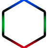
あなたは、イメージエディタを使用して、すべての周りの内側の空白すなわちアルファチャンネルを削除し、ちょうど国境アニメーションを保つことによってGIFを利用することができます。私はgimpが軽量で、かなり良い選択肢だと言っています。 –
GIFは最悪のシナリオです。可能であれば、これをCSSにしたいと思います。 – Nedas
さて、あなたはSVGも避けています –