2016-10-18 2 views
1

私はそれに結合領域でフォームを持っていると私はこのような何かをレイアウトするフレキシボックスを取得する方法を見つけ出すためにしようとしてきた:フレックスボックスでこのレイアウトを作成するにはどうすればよいですか?

Desired Design

可能であれば、私はどのように行うことができこれは親コンテナの量を最小限に抑えながらですか? (または、なぜ私はそれをしたくないかもしれませんか?)

これを達成していないことで十分に困惑していると私は求めているのは正しい動きです。それでも私の頭を包んでいる。例から変更

+0

が重複する可能性: http://stackoverflow.com/q/40011471/3597276 –

+1

変更されたデモを複製から:https://jsfiddle.net/0w8mv3n4/4/ –

答えて

1

.wrapper { 
 
    display: -webkit-box; 
 
    display: -moz-box; 
 
    display: -ms-flexbox; 
 
    display: -webkit-flex; 
 
    display: flex; 


    -webkit-flex-flow: row wrap; 
 
    flex-flow: row wrap; 


    font-weight: bold; 
 
    text-align: center; 
 
} 


.wrapper > * { 
 
    padding: 10px; 
 
    flex: 1 100%; 
 
} 


.header { 
 
    background: tomato; 
 
} 


.footer { 
 
    background: lightgreen; 
 
} 


.main { 
 
    text-align: left; 
 
    background: deepskyblue; 
 
} 


.aside-1 { 
 
    background: gold; 
 
} 


.aside-2 { 
 
    background: hotpink; 
 
} 


@media all and (min-width: 600px) { 
 
    .aside { flex: 1 auto; } 
 
} 


@media all and (min-width: 800px) { 
 
    .main { flex: 3 0px; } 
 
    .aside-1 { order: 1; } 
 
    .main { order: 2; } 
 
    .aside-2 { order: 3; } 
 
    .footer { order: 4; } 
 
} 


body { 
 
    padding: 2em; 
 
}
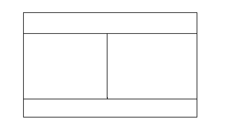
<div class="wrapper"> 
 
    <header class="header">Header</header> 
 
    <aside class="aside aside-1">Aside 1</aside> 
 
    <aside class="aside aside-2">Aside 2</aside> 
 
    <footer class="footer">Footer</footer> 
 
</div>

hereを発見しました。 css-tricksへの完全な信用。

編集:css-tricksの記事を強くお勧めします。すべてのもののために非常に役立つリソースあなたは、いくつかのCSSラインとボディからこのレイアウトを構築することができ

+0

私は〜10を待たなければなりませんこれを正解とマークするには分が必要ですが、明らかにそうです。ありがとうございました! フレックスとは何ですか:1 100%; 。ラッパーの子供たちは何をしますか? – dislikesAppleCores

+0

これは、flex-growとflex-shrinkを1に、flex-basisを100%に設定するための省略表現です。 'flex:1 2'なら実際にはgrow/shrinkだけを設定しているので(2は無制限の数字で、100%は技術的にはそうではないので)、私は個人的には難しいと思う人もいます。 – Pat

0

をフレキシボックス:(or download code samples)でプレイする

html, 
 
body { 
 
    height: 100%;/* or 100vw just for body */ 
 
    margin:0 /* reset */ 
 
} 


body, 
 
section { 
 
    display: flex; 
 
} 
 
/* eventually : section {overflow:auto} if you want to keep footer down the screen no matter how much content */ 
 
body { 
 
    flex-flow: column; 
 
} 
 
section, 
 
article { 
 
    flex: 1;/* use whole space avalaible if only child or share it evenly when multiple children */ 
 
} 
 
/* add borders to see elements */ 
 
header, 
 
footer, 
 
article { 
 
    border: solid; 
 
    padding: 1em; 
 
} 


/* break point without mediaqueries ? 
 
uncomment this below */ 
 
/* article { 
 
    min-width:320px;/* 2 articles make break point at average 640px */ 
 
}*/
<header> 
 
    header any height 
 
</header> 
 
<section> 
 
    <article>Side</article> 
 
    <article>Side</article> 
 
</section> 
 
<footer> 
 
    footer any height 
 
</footer>

http://codepen.io/gc-nomade/pen/WGazGX

関連する問題