0
.row {

     display: flex;

    }


    .col {

     flex: 1;

    }


    .container {

     display: flex;

     align-items: center;

     background-color: blue;

     font-size: 12px;

     color: #87909A;

     width: 275px;

     margin-top: 20px;

     margin-left: 20px;

     height: 70px;

    }


    .textview {

     height: 50px;

     line-height: 35px;

     padding-left: 13px;

     position: relative;

     border-bottom: 1px solid #CFD4D9;

     background-color: #FFF;

     color: #5C6570;

     padding-right: 13px;

     margin-left: 20px;

     vertical-align: middle;

     display: inline-block;

    }


    .middle {

     vertical-align: middle;

    }
<!DOCTYPE html>
<html lang="en">
<head>
<meta charset="utf-8">
<link rel="stylesheet" href="event.css">
</head>
<body>
<div class="row">
<div class=".col">
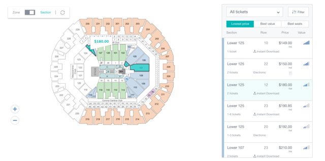
<img src="map.png" style="height: 300px; width: 300px; margin-top: 20px;">
</div>
<div class=".col">
<div class="container">
<div class="textview">
<span class="middle">Some text</span>
</div>
<div class="textview">
<span class="middle">Some text</span>
</div>
</div>
</div>
</div>
</body>
</html>私はこのようなビューを作成したいが、私は上記のようなものを持っていると拡大されていませんか?誰かが、私が白いコンテナビューを青い背景の中央に配置する方法と、白いコンテナビュー内にテキストを中央に配置する方法を教えてもらえますか?
また、以下のレイアウトを実現する正しい方法であれば、一般的なフィードバックをいただけますか?私は地図が70%で、右側が30%を占める横並びのビューを作成したいと思います。
 する方法になります]
'クラス=」。 col "はおそらくタイプミスで、' class = "col" ''でなければなりません。 – fen1x
2つの白いボックスが青い背景の内側に水平に配置されますか?あなたは既に白いボックスの中にテキストを中心に置いているように見えます。 – duyn9uyen
更新された回答を確認私は理解するためにいくつかの説明を追加しました。 – LKG