1
携帯で見たときに小さな静的なウェブページが正しく表示されない原因を突き止めようとしています(Chrome androidアプリに表示されます)。ドキュメントによると、列は自動的にモバイルに積み重なるはずです。しかし、私はそれを見ると、画面に正しくフィットする幅のページが表示されていますが、列は1つの行にとどまっています。下のスクリーンショットに示されています。 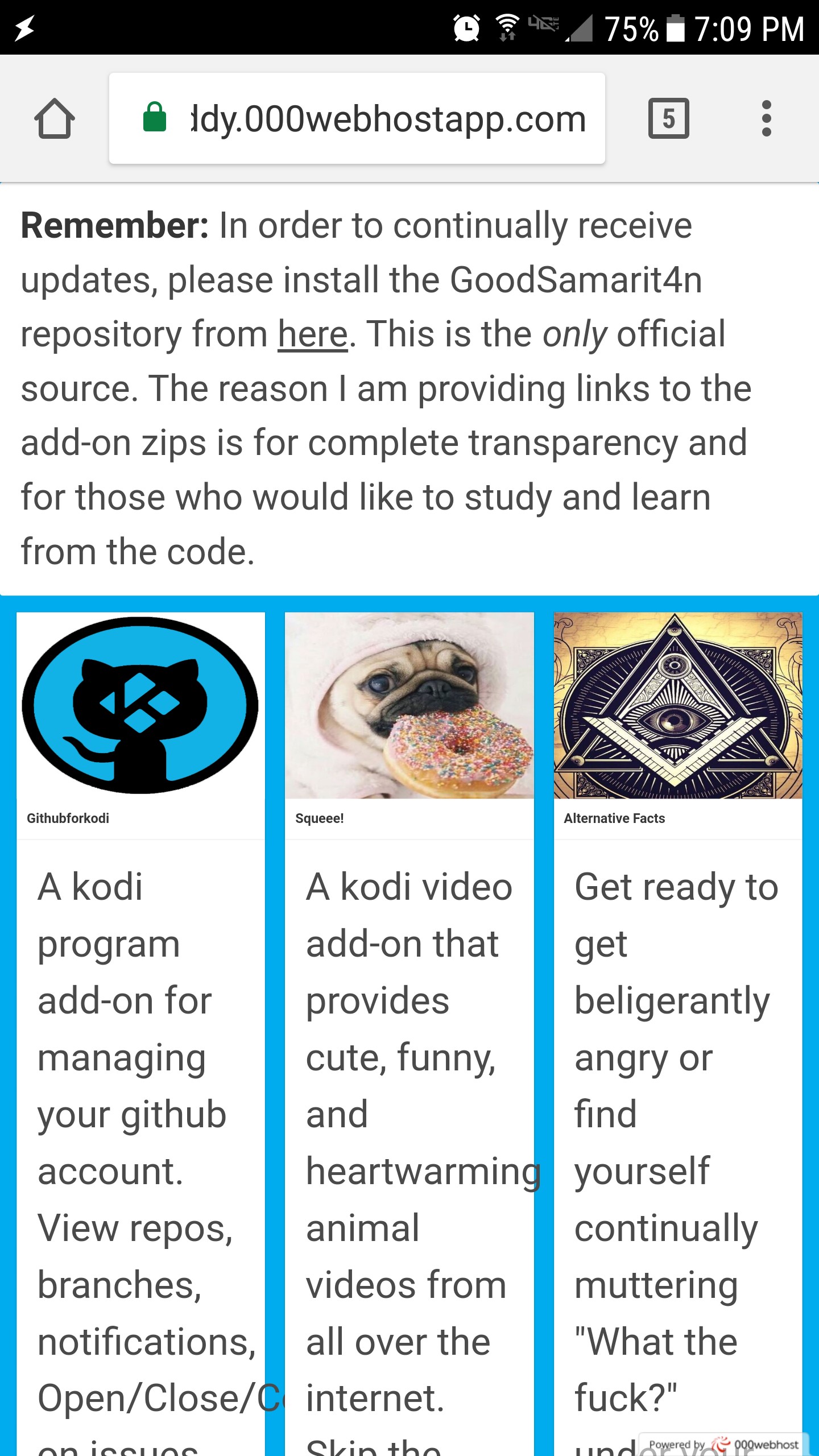 ChromeモバイルブラウザでBulma cssフレームワークの列が積み重なっていない
デスクトップブラウザでページのサイズを変更して自分のコードであるかどうかをテストしました。そのページは予想通りに応答し、カードを1列に積み重ねました。ここに私の電話で模倣されたデスクトップビューがあります。 
何が起こっているのでしょうか?私は間違って何をしていますか?コードはこちら
<html>
<head>

<link rel="stylesheet" type="text/css" href="https://cdnjs.cloudflare.com/ajax/libs/bulma/0.4.3/css/bulma.css"/>

</head>
<body style="background-color:#00aced;">

    <div class="container">
     <div class="notification" style="background-color:#fff">
      <strong>Remember:</strong> In order to continually receive updates, please install the GoodSamarit4n repository from
      <a href="">here</a>. This is the <em>only</em> official source. The reason I am providing links to the add-on zips is for complete transparency and for those who would like to study and learn from the code.
      <br>
     </div>
    </div>

    <div style="padding: 20px;" class="container">

     <div class="columns">
      <div class="column">
       <div class="card">
        <div class="card-image">
         <figure class="image is-4by3">
          <img src="https://pugdaddy.000webhostapp.com/images/githubforkodi.png" alt="Image">
         </figure>
        </div>
        <header class="card-header">
         <p class="card-header-title">
          Githubforkodi
         </p>
        </header>
        <div class="card-content">
         <div class="content">
          A kodi program add-on for managing your github account. View repos, branches, notifications, Open/Close/Comment on issues, Merge/Deny pull requests, Get real-time notifications, And much more! The power of github combined with the simplicity of kodi.
          Creator <a href="https://twitter.com/good_samarit4n">@goodsamarit4n</a>. <a>#kodi</a> <a>#github</a> <a>#program</a> <a>#add-on</a>
          <br>
          <small>8:00 PM - 24 Jul 2017</small>
         </div>
        </div>
       </div>
      </div>
      <div class="column">
       <div class="card">
        <div class="card-image">
         <figure class="image is-4by3">
          <img src="https://pugdaddy.000webhostapp.com/images/pugdonut.png" alt="Image">
         </figure>
        </div>
        <header class="card-header">
         <p class="card-header-title">
          Squeee!
         </p>
        </header>
        <div class="card-content">
         <div class="content">
          A kodi video add-on that provides cute, funny, and heartwarming animal videos from all over the internet. Skip the endless clicking around your favorite sites and let Squeee! bring all of those sites to you in an easy-to-digest fashion. Click through videos one at a time or play an entire playlist and just sit back and embrace the fluffy.
          Creator <a href="https://twitter.com/good_samarit4n">@goodsamarit4n</a>. <a>#kodi</a> <a>#squeee</a> <a>#video</a> <a>#add-on</a> <a>#cute</a> <a>#animals</a>
          <br>
          <small>8:00 PM - 24 Jul 2017</small>
         </div>
        </div>
       </div>
      </div>
      <div class="column">
       <div class="card">
        <div class="card-image">
         <figure class="image is-4by3">
          <img src="https://pugdaddy.000webhostapp.com/images/illuminati.jpg" alt="Image">
         </figure>
        </div>
        <header class="card-header">
         <p class="card-header-title">
          Alternative Facts
         </p>
        </header>
        <div class="card-content">
         <div class="content">
          Get ready to get beligerantly angry or find yourself continually muttering "What the f###?" under your breath. For those who enjoy seeing just how crazy some folks are. With documentaries on conspiracy theories gathered from all over the web. If you don't see a topic, feel free to tweet at me and I'll see about adding it for you.
          Creator <a href="https://twitter.com/good_samarit4n">@goodsamarit4n</a>. <a>#kodi</a> <a>#alternativefacts</a> <a>#video</a> <a>#add-on</a> <a>#conspiracy</a> <a>#theories</a>
          <br>
          <small>8:00 PM - 24 Jul 2017</small>
         </div>
        </div>
       </div>
      </div>
     </div>
    </div>
</body>
</html>
ああ、私はそれが簡単だったとは思えません。しかし、私はそれがドキュメントで(または少なくとも彼らが列のクラスを議論する場所ではない)それがどこにあるかを見つけることができなかった。どうもありがとうございます! – CaffeinatedCoder
それはモバイルデバイスのレイアウトを制御するための標準的なルールであり、私は[bootstrap](http://getbootstrap.com/getting-started/#template)の世界からも学びました!あなたはそれについて[ここ](https://www.w3schools.com/css/css_rwd_viewport.asp)と[there](https://developer.mozilla.org/en/docs/Mozilla/Mobile/Viewport_meta_tag)を読むことができます。 )。 @CaffeinatedCoder – ironcladgeek
バックグラウンドを提供してくれてありがとう。私はこれがモバイルでのサイト作業を始めようとしたのは初めてのことなので、私は分かりませんでした:P – CaffeinatedCoder