2017-03-08 17 views
0

私は最近、ブートストラップ4アルファ版でプロジェクトを作成して遊んできました。試してみると、サイズの違うアップロードされた画像を表示すると正方形として表示されません。画像を正方形で表示するにはどうすればよいですか?

Instagramではサムネイル用の正方形の画像しか表示されなかったことを覚えていますか?私はそれを達成したい。私はいくつかの研究を行い、他の人々によってダウン書かれたものの束を試みたが、それに十分近くに来ただけの事はこの1つだっいる: https://stackoverflow.com/a/23518465/1067213

が、結果は、私は実際にそれが何をしたいかではありません。 Here you can see the difference in the three images

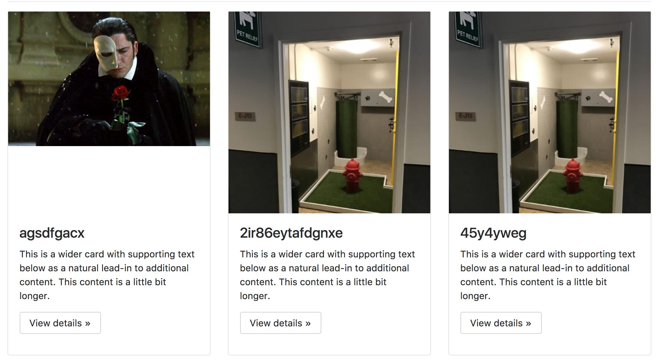
画像が正方形ではなく、最初のものの下に隙間があり、他の2つの列と揃うようになっています(すべての列が同じ幅と高さになるようにします)。

私はDjangoを使用して画像ファイルへのURLを作成します。ここで

は私のhtmlです:

<div class="row"> 
    {% if competition_list %} 
    {% for competition in competition_list %} 

     <div class="col-md-4"> 
      <div class="card"> 
      <div class="image"> 
      <img class="card-image-top img-fluid" src="/{{competition.image.url}}" > 
      </div> 
      <div class="card-block"> 
       <h4 class="card-title">{{competition.name}}</h4> 
       <p class="card-text">This is a wider card with supporting text below as a natural lead-in to additional content. This content is a little bit longer.</p> 
       <p><a class="btn btn-secondary" href="https://v4-alpha.getbootstrap.com/examples/jumbotron/#" role="button">View details »</a></p> 
      </div> 
      </div> 
     </div> 

    {% endfor %} 
    {% else %} 
    <p>No competitions in this category, please try an other category</p> 
    {% endif %} 
    </div> 
ここ

は私のCSSです:

.card { 
    margin-bottom: 10px; 
} 

.image{ 
    position:relative; 
    overflow:hidden; 
    padding-bottom:100%; 
} 
.image img{ 
    position:absolute; 
} 

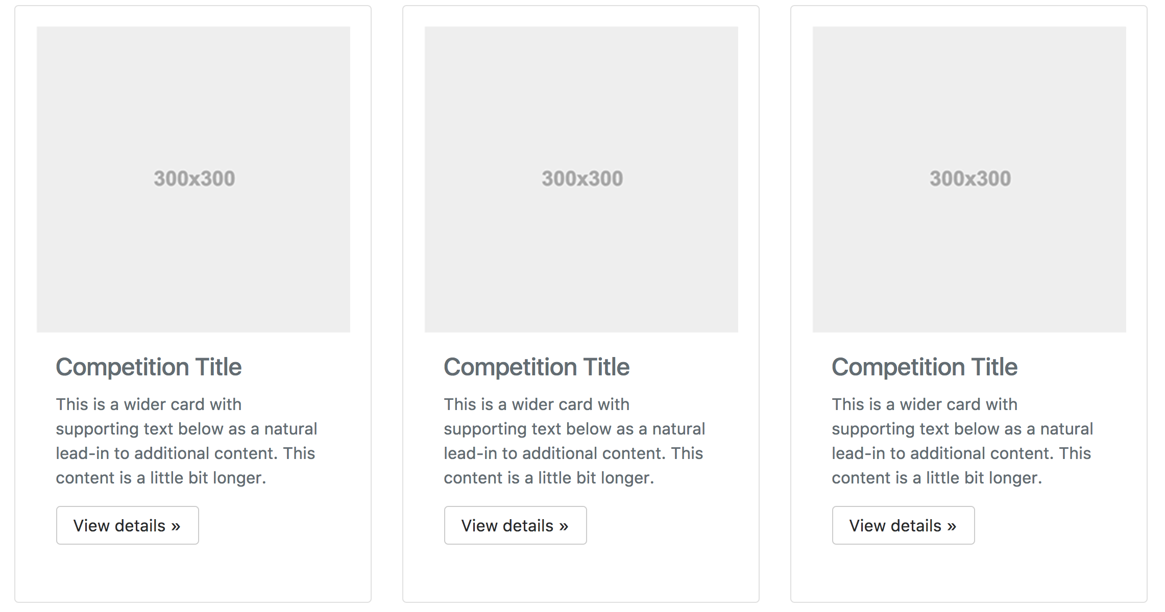
理想的な結果は、ビットのようになります。

desired result あなたが必要な場合は、私に教えてくださいそれ以上の情報。

ありがとうございます!

答えて

1

これは実際にDjangoやBootstrapとは関係ありません。画像を背景として.imageに設定して、正方形に切り取ることができます。

<div class="image" style="background-image: url(/{{competition.image.url}});" ></div> 

また、あなたはCSS背景画像を持つ要素を埋めるために適用されていることを確認してください。

.card .image { 
    background-size: cover; 
} 

また.imageの高さの100%に伸ばし、非表示にする画像を強制的に試みることができます水平方向のオーバーフローが発生しますが、バックグラウンドのアプローチは簡単です。

+0

。私はすでにそれを実際に動作しているCSSで。私はしかし、質問があります。この作物を中心にしますか? –

+0

イメージを中央に配置するには、次のようにします。 'background-position:center center; – isherwood

+0

ありがとう!これは簡単でポイントまでストレートでした! –

0

あなたはラッパーを使用し、幅、最大幅と最小高さで遊ぶことができます:

<div class="image-wrapper"> 
    <img src="http://placehold.it/350x300"> 
</div> 

<div class="image-wrapper"> 
    <img src="http://placehold.it/500x350"> 
</div> 

<div class="image-wrapper"> 
    <img src="http://placehold.it/300x500"> 
</div> 

あなたが100%に幅を設定し、それが高さを拡大縮小します。

.image-wrapper { 
    width: 300px; 
    height: 300px; 
    overflow: hidden; 
    position: relative; 
    background: rgba(0, 0, 0, 0.5); 
    margin: 10px 0; 
} 
.image-wrapper img { 
    width: 100%; 
    position: absolute; 
    left: 0; 
    top: 50%; 
    transform: translateY(-50%); 
} 

画像が垂直にセンタリングされるように、上、左、および変換が追加されました。

background-size:coverを使用して、背景位置で再生することもできます。

<div class="use-cover-background square" style="background-image: url(http://placehold.it/350x300)"></div> 

<div class="use-cover-background square" style="background-image: url(http://placehold.it/500x300)"></div> 

<div class="use-cover-background square" style="background-image: url(http://placehold.it/300x500)"></div> 

// CSS

.use-cover-background { 
    background-size: cover; 
    background-position: center; 
} 
.square { 
    margin: 10px 0; 
    width: 300px; 
    height: 300px; 
} 

彼らが作業を参照してください:ちょうどあなたがここに提供したCSSは何も表示されません追加https://jsfiddle.net/mcgnyfw9/

よろしく、

関連する問題