2016-04-09 3 views
4

その正方形のホバーに回転効果が必要でしたが、私が得ることができるものは以下の通りです。HTML&CSSを使用してスピン効果を作成するには?
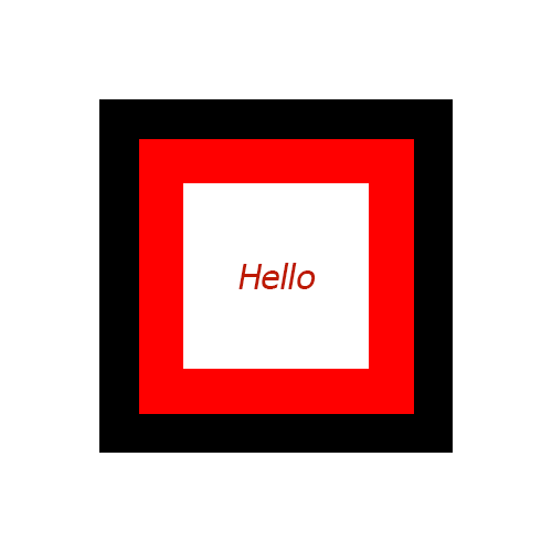
Image

HTML

<div class="mainSquare"> 
    <div class="firstInnerSquare"> 
    <div class="lastInnerSquare"> 
     Hello 
    </div> 
    </div> 
</div> 

CSS

.mainSquare{ 
    width:160px; 
    height:160px; 
    background:black; 
    margin: 50px auto; 
    padding:25px; 
} 
.firstInnerSquare{ 
    width:110px; 
    height:110px; 
    background:red; 
    padding:25px; 
} 
.lastInnerSquare{ 
    text-align:center; 
    width:110px; 
    padding: 46px 0px; 
    background:white; 
} 

Fiddle

希望助けを得るために。

+5

あなたが、少なくとも自分のためにこれをコーディングすることを試みることが期待されます。スタックオーバーフローはコードを書くサービスではありません。私はあなたがGoogleを介して、またはSOを検索することによって、いくつかの追加の研究を行い、試してみることを提案します。それでも問題が解決しない場合は、**あなたのコード**に戻って、あなたが試したこととそれがうまくいかなかった理由を説明してください。 –

+0

これまでCSSの小道具を聞いたことがありますか? –

+0

私はCSSとアニメーションの多くの知識を持っています –

答えて

10

これは、1つの要素と2つの擬似コードを使用して行うことができます。 2つの擬似要素をコンテナ要素より大きくし、コンテナの後ろに配置し、rotateのアニメーションを追加します。

注:これは、開始に役立つ基本サンプルです。私はあなたのために微調整部分を残すだろう。 this MDN pageのCSSアニメーションプロパティの詳細を読むことができます。

.shape { 
 
    position: relative; /* used to position the pseudos relative to the parent */ 
 
    height: 100px; 
 
    width: 100px; 
 
    background: white; 
 
    border: 1px solid; 
 
    margin: 100px; /* required because children are larger than parent */ 
 
} 
 
.shape:after, 
 
.shape:before { 
 
    position: absolute; 
 
    content: ''; 
 
} 
 
.shape:before { 
 
    height: 125%; /* make one pseudo 25% larger than parent */ 
 
    width: 125%; 
 
    top: -12.5%; /* 25/2 to make sure its center is same as the parent's */ 
 
    left: -12.5%; /* 25/2 to make sure its center is same as the parent's */ 
 
    background: red; 
 
    z-index: -1; /* send it behind the parent */ 
 
} 
 
.shape:after { 
 
    height: 150%; /* make this pseudo larger than the parent and the other pseudo */ 
 
    width: 150%; 
 
    top: -25%; /* 50/2 to make sure its center is same as the parent's */ 
 
    left: -25%; /* 50/2 to make sure its center is same as the parent's */ 
 
    background: black; 
 
    z-index: -2; /* send it behind both the parent and other pseudo */ 
 
} 


/* add animation when hovering on parent */ 
 
.shape:hover:before { 
 
    animation: rotate 3s linear infinite; 
 
} 
 
.shape:hover:after { 
 
    animation: rotate-rev 3s linear infinite; 
 
} 
 
@keyframes rotate { 
 
    to { 
 
    transform: rotate(359deg); /* some browsers don't display spin when it is 360 deg */ 
 
    } 
 
} 
 
@keyframes rotate-rev { 
 
    to { 
 
    transform: rotate(-359deg); /* reverse direction rotate */ 
 
    } 
 
}
<div class='shape'></div>

+0

スピードを遅くする方法はありますか? –

+0

@ kishore.k.vaishnav: 'animation-duration'を増やしてスピンを遅くすることができます。質問の下であなたのコメントを見た後、[このMDNページのアニメーション](https://developer.mozilla.org/en/docs/Web/CSS/animation)を参照することをお勧めします。 – Harry

+1

@ハリーGIFスピンとして速すぎる...グッドジョブ.. –

6

ここで元の構造とひとつのキーフレーム文を使用して、一つだ:、変更する必要のあるすべての

のdivあたり、アニメーションの再生時間と方向です。 「中間」divのタイミングは外側/内側の50%にする必要があります。

.mainSquare { 
 
    width: 160px; 
 
    height: 160px; 
 
    background: black; 
 
    margin: 50px auto; 
 
    padding: 25px; 
 
    animation: spin 2s infinite linear; 
 
} 
 
.firstInnerSquare { 
 
    width: 110px; 
 
    height: 110px; 
 
    background: red; 
 
    padding: 25px; 
 
    animation: spin 1s infinite linear reverse; 
 
} 
 
.lastInnerSquare { 
 
    text-align: center; 
 
    width: 110px; 
 
    padding: 46px 0px; 
 
    background: white; 
 
    animation: spin 2s infinite linear; 
 
} 
 
@keyframes spin { 
 
    to { 
 
    transform: rotate(1turn); 
 
    } 
 
}
<div class="mainSquare"> 
 
    <div class="firstInnerSquare"> 
 
    <div class="lastInnerSquare"> 
 
     Hello 
 
    </div> 
 
    </div> 
 
</div>

+0

ニース。これはちょうど1つのキーフレームが必要です:) – Harry

関連する問題