0
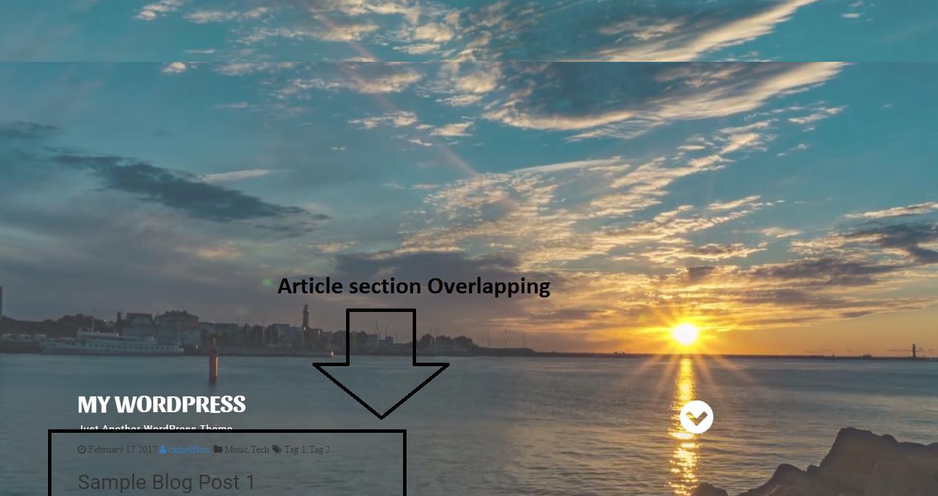
WordPressサイトの最上位ヘッダーセクションのブートストラップスケルトンを作成しています。そのセクションのコンテンツをヘッダーセクションにオーバーラップして追加したときに、正常に動作しているビデオ背景がありました 私のサイトは内容が異なるブートストラップセクションに重複しています
私のコードは
* {

    margin: 0;

    padding: 0;

    box-sizing: border-box !important;

}


body {

    font-family: 'Roboto', sans-serif;

}


/* ======================= Header ======================== */


#background {

    position: fixed;

    top: 50%;

    left: 50%;

    min-width: 100%;

    min-height: 100%;

    width: auto;

    height: auto;

    z-index: -100;

    -webkit-transform: translateX(-50%) translateY(-50%);

    transform: translateX(-50%) translateY(-50%);

    background-size: cover;

}


video {

    position: absolute;

    top: 0;

    left: 0;

    width: 100%;

    z-index: -1;

    opacity: 0.78;

}


.header .text-contant {

    margin-top: 40%;

}


.header .text-contant h1,

.header .text-contant p{

    color: #fff;

}


.header .text-contant h1 {

    text-transform: uppercase;

    font-family: 'Sansita', sans-serif;

    font-weight: bold;

}


.header .text-contant p {

    letter-spacing: 1px;

}


.header .text-contant i {

    padding-top: 33px;

    color: #fff;

}


@media(max-width:992px) {

    .header .text-contant {

    margin-top: 50%;

}

}


@media(max-width:768px) {

    .header .text-contant {

    text-align: center;

}

}


@media(max-width:480px) {

    .header .text-contant {

    margin-top: 80%;

}

}


@media(max-width:320px) {

    .header .text-contant {

    margin-top: 100%;

}

}
<!DOCTYPE html>
<html lang="en">
<head>
<meta charset="utf-8">
<meta http-equiv="X-UA-Compatible" content="IE=edge">
<meta name="viewport" content="width=device-width, initial-scale=1">
<!-- The above 3 meta tags *must* come first in the head; any other head content must come *after* these tags -->
<title>Bootstrap Boilerplate</title>
<!-- Bootstrap -->
<link href="/css/bootstrap.min.css" rel="stylesheet">
<link rel="stylesheet" href="/css/font-awesome.min.css">
<link href="https://fonts.googleapis.com/css?family=Roboto|Sansita:400,700" rel="stylesheet">
<link rel="stylesheet" href="/css/style.css">
<!-- HTML5 shim and Respond.js for IE8 support of HTML5 elements and media queries -->
<!-- WARNING: Respond.js doesn't work if you view the page via file:// -->
<!--[if lt IE 9]>
<script src="https://oss.maxcdn.com/html5shiv/3.7.3/html5shiv.min.js"></script>
<script src="https://oss.maxcdn.com/respond/1.4.2/respond.min.js"></script>
<![endif]-->
</head>
<body>
<!-- ===================== HEADER ============================= -->
<section class="header">
<video autoplay loop muted poster="/img/pexels-photo-27884.jpg" id="background">
<source src="/vdo/River%20-%206815.mp4" type="video/mp4">
</video>
<div class="container text-contant">
<div class="row">
<div class="col-sm-8">
<h1>My WordPress</h1>
<p>Just Another WordPress Theme</p>
</div>
<div class="col-sm-3 col-sm-offset-1">
<a href="#"><i class="fa fa-chevron-circle-down fa-4x" aria-hidden="true"></i></a>
</div>
</div>
</div>
</section>
<!-- ===================== MAIN ============================= -->
<section id="article">
<div class="container">
<div class="row">
<div class="col-md-8">
<article class="blog">
<div class="blog-meta-detail">
<i class="fa fa-clock-o" aria-hidden="true"> February 17 2017 </i>
<a href="#"><i class="fa fa-user" aria-hidden="true"> cannelflow</i></a>
<i class="fa fa-folder" aria-hidden="true"> Music,Tech</i>
<i class="fa fa-tags" aria-hidden="true"> Tag 1,Tag 2</i>
</div>
<div class="blog-title">
<h2>Sample Blog Post 1</h2>
</div>
</article>
</div>
<div class="col-md-4">
<aside class="sidebar"></aside>
</div>
</div>
</div>
</section>
<!-- jQuery (necessary for Bootstrap's JavaScript plugins) -->
<script src="/js/jquery-3.1.1.min.js"></script>
<!-- Include all compiled plugins (below), or include individual files as needed -->
<script src="/js/bootstrap.min.js"></script>
<script src="/js/main.js"></script>
</body>
</html>私はあなたが(携帯電話とタブレットのためのウェブサイト)の窓幅を減らすように、ビデオの高さを変更するにはメディアクエリを使用して、ビデオのための一定の高さを使用することをお勧め事前
非依存性 – mlegg